
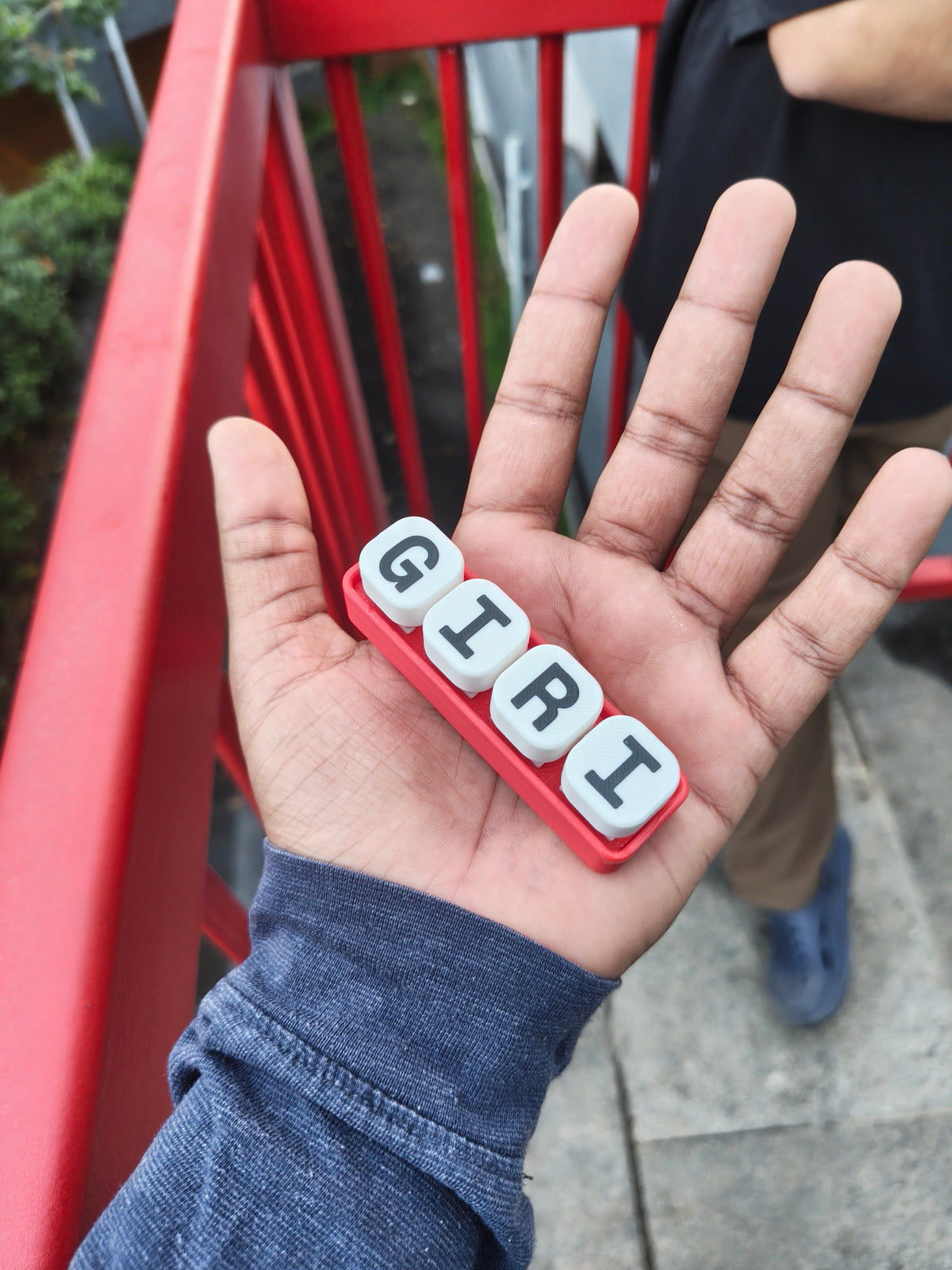
Not every personal object needs a long message. In this photograph, four white letter tiles spell GIRI against a red base. The hand gives the composition an immediate sense of scale, while the everyday background makes the object feel portable and informal. Its identity comes from a few clear choices.
The small format is the point
A short row is easy to read at a glance. The pale tiles separate the letters from the coloured base, and the dark characters keep the name legible. There is enough structure to feel intentional without filling the object with extra decoration.
That restraint is particularly useful for personalisation. A name or set of initials should remain the main event. If the base, lettering and symbols all compete for attention, the message can become harder to read even when each individual element is appealing.
Choose the layout for the message
The TilePOP collection includes several arrangements, so the strongest choice is the one that suits what you actually want to say. A short horizontal layout feels natural for a short name. A larger grid leaves room for a different composition. More space is an option, rather than a requirement.
The trade-off is simple: a compact layout has less room for long names or several symbols. We would choose the wording first, then select the format. That avoids squeezing a personal message into a shape that does not suit it.
Our design take
The charm here comes from being specific. Four letters, a confident base colour and a clear contrast are enough to make a small object feel recognisably yours. Start with the detail that matters most—a name, initials or a favourite short word—and let the rest of the design support it.