
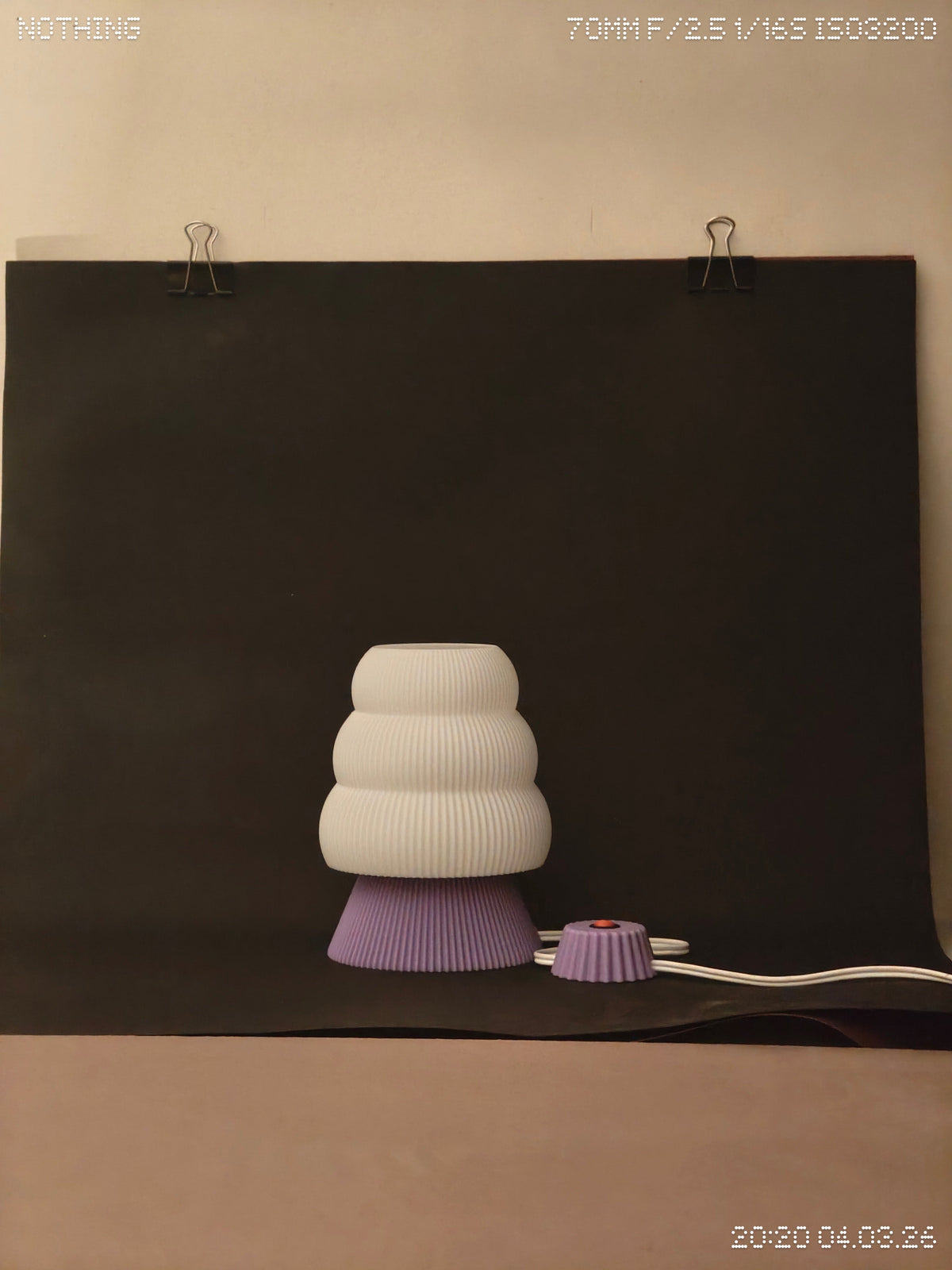
A clean photograph and a lived-in photograph tell different parts of the same story. The studio setup shows a pale, tiered lamp against a dark backdrop, with the clips, cable and surrounding room still visible. The shelf view puts a similar cloud-like form among everyday display objects. Neither setting needs to pretend to be the other.
What the plain background gives us
Against the dark sheet, the outline is easy to follow. The lavender base is visible, the white tiers are distinct, and there is little competing colour. It is a useful way to judge the proportions of an object without the room doing too much of the styling.
The wider frame is useful too. Seeing the backdrop edge and cable makes the photograph feel like a working view rather than a promise that the object will float in a perfectly empty space. Real products live with cables, shelf edges and nearby objects.

What changes on a shelf
The red base in the shelf photograph becomes a strong focal point among the pale forms around it. That is the advantage of a colour accent: even a relatively small area can organise the whole arrangement. The trade-off is that nearby objects can interrupt the outline, especially when the shelf is crowded.
We would start by checking the clear space above and beside a lamp, then deciding where its cable will sit. A beautiful object should not need an entirely new room around it. A little room to breathe, and a practical place for the things that accompany it, are usually more helpful than an elaborate styling setup.
Use both views when choosing
Look at a product on its own to understand its form. Then imagine it among your actual books, plants and daily objects. Those are different decisions, and both deserve attention. The best fit is the piece whose character survives the move from a photograph into your own space.